In this tutorial, we will learn how to display customer's ordered data in a gauge chart dynamically. As you choose a customer name from the select list the gauge pointer moves to the value which is equivalent to the customer's ordered amount.
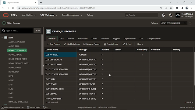
For this tutorial, we will be using the DEMO_CUSTOMERS table that we have been using throughout our tutorials. To create this table, you can follow this LINK.
let's start the proceedings. First of all, you will need to upload three JavaScript files along with one CSS file. To get these files, follow this LINK to get the Source Code.
Go to Shared Components. Click the option Static Workspace Files. Click the Create File button. Select all four files and click the Create button.
Next, you have to Create a New page. Select the option Blank Page. After page creation, we have to add some Regions and Page Items to this page. Change the Page Template property from Theme Default to the Left Side Column, which is used for the left-side display position for search filters, charts, and other interactive widgets.
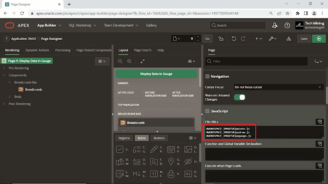
Scroll down to the file URLs section, under JavaScript. Paste the reference of the three JavaScript files that we uploaded. These references are provided in the Source Code, in the file named references.
Now, scroll down to the CSS section and expand the File URLs section. Paste the reference of the CSS file from the same file named references in the source code. An alternate method, to find these references is in Shared Components, under the Static Workspace Files option.
Scroll down to the Security Section, and set the Page Access Protection property to Unrestricted. In the unrestricted property, the value of the page may be requested using a URL with or without session State arguments and without having to have a checksum.
Create a New Region. Change its position from the Body to the Left-Side column. The change is immediately reflected in the layout tab in the central pane of the page designer.
Turn On the Switch of the property named Region Display Selector, when turned On, it provides a page-level navigation control for other regions on the page.
Next, create the following page items. The first-page item (in red color) is of a select list type, that will display the list of customers' names from the DEMO_CUSTOMERS table at runtime. By selecting the template property to Required-Floating and Turning On the Value Required properties (in yellow colors), we make a page item mandatory to be selected or filled.
Under the list of values section, Set the type property to SQL Query. Use this SQL Query, which fetches the customer's first and last names from the DEMO_CUSTOMERS table.
select cust_first_name||' '||cust_last_name d, customer_id r
from demo_customers
order by cust_first_name
When sensitive data must persist in a session it should be saved in APEX Session State tables in encrypted form. By Turning Off store value encrypted in session State attribute encrypted stored values are automatically decrypted when read.
Create the remaining page items, which are text field page items. This page item (in red color) will hold gauge labels. Set the default type to static. Enter 500 in the static value (in yellow colors). This value will be displayed in the gauge at runtime.
This page item will hold the upper-bound values of the gauge between 50 and 2500 covered by green color in the gauge. Enter 5000 in the static value which is the highest value of the gauge.
This page item will cover the warning portion of the gauge between 2500 and 1000 covered by yellow color in the gauge. Enter 2500 in the static value which is the upper bound of the warning portion.
Create another page item. The page item is responsible for the critical area of the gauge between 0 and 1000 covered by red color. Enter 1000 in the static value which is the highest value of the critical portion.
This item will display the big marks in the gauge called the Major Tick Interval. In the static value, you can type any number you want. I have entered 1000 because I want my gauge chart to display a major tick interval after every 1000.
Create the last page item which will display small marks in the gauge known as minor tick interval. In the static value I have entered 100 so my gauge chart will display a minor tick interval after every 100. In simple words, the concept of major and minor tick intervals can be understood from a normal scale carrying inches and centimeters respectively.
Now, create a new static content type region. Under the Source section, Expand the HTML code area. Copy this HTML code. This HTML code will create the body of our gauge chart.
<div id="demoWidget" style="position: relative;">
   <div style="float: left;" id="gaugeContainer"></div>
   <div id="gaugeValue" style="position: absolute; top: 235px; left: 132px; font-family: Sans-Serif; text-align: center; font-size: 17px; width: 70px;"></div>
</div>
Create a new Text field type page item, named Ordered Amount. Set type under the Source section to SQL query (return single value). Use this query in the page designer. In this query, Replace the page item number by using your own page item number. This query makes a sum of the order total column in the DEMO_ORDERS table where the Customer ID column value in the DEMO_CUSTOMERS table matches the name of the customer selected in the select list. Select the second type for the Used attribute.
select sum(order_total) order_total
from demo_orders o
where customer_id=:P46_CUSTOMER
Next, Click on the Dynamic Actions tab. Right-click on the page load event and create a Dynamic action. Click on the show node.
Set the action property to Execute JavaScript Code (in red color). Use the Dynamic Action Code file (in yellow color). This Dynamic action code internally controls the whole process of the gauge chart via functions. In the code, Replace the XX symbols by providing your page number. Save your work. Click on the Run Application button (in blue color).
$(document).ready(function () { $('#gaugeContainer').jqxGauge({
ranges: [{ startValue: 1, endValue: $v("PXX_CRITICAL"), style: { fill: '#e02629', stroke: '#e02629' }, endWidth: 5, startWidth: 1 },
{ startValue: $v("PXX_CRITICAL"), endValue: $v("PXX_WARNING"), style: { fill: '#fbd109', stroke: '#fbd109' }, endWidth: 10, startWidth: 5 },
{ startValue: $v("PXX_WARNING"), endValue: $v("PXX_OK"), style: { fill: '#4bb648', stroke: '#4bb648' }, endWidth: 15, startWidth: 10 }],
max:$v("PXX_OK"),
labels: { interval: $v("PXX_LABELS_INTERVAL") },
ticksMajor: { interval: $v("PXX_MAJOR_INTERVAL"), size: '9%' },
ticksMinor: { interval: $v("PXX_MINOR_INTERVAL"), size: '5%' },
value: 0, // initial pointer position
animationDuration: 1200
});
$('#gaugeContainer').on('valueChanging', function (e) {
$('#gaugeValue').text($v("PXX_ORDER_TOTAL") + ' Amount');
});
$('#gaugeContainer').jqxGauge('value', $v("PXX_ORDER_TOTAL"));
});This is the gauge chart, as you choose a customer name from the select list the gauge pointer moves to the value which is equivalent to the customer's ordered amount (highlighted in red color). These are the remaining fields (highlighted in purple color), 5000 upper bound of the gauge covered by green color. 2500 upper bound of the warning portion covered by yellow color. 1000 upper bound of the critical portion covered by red color. Major tick interval after every 1000 in the gauge chart. Minor tick interval after every 100.
let's change the values of the two text fields (highlighted in purple color), Minor & Major tick interval, and observe the change. Now, the big marks appear with an interval of 500 (highlighted in orange color lines) in the gauge. The small marks are now displaying at an interval of 50 (highlighted in black color dots) in the gauge.. Select any other customer from the list to see its amount in the gauge as well as in the ordered amount text field (highlighted in blue color) in the gauge..
That's it for now. If you got stuck somewhere in this tutorial, you can click the link below.


